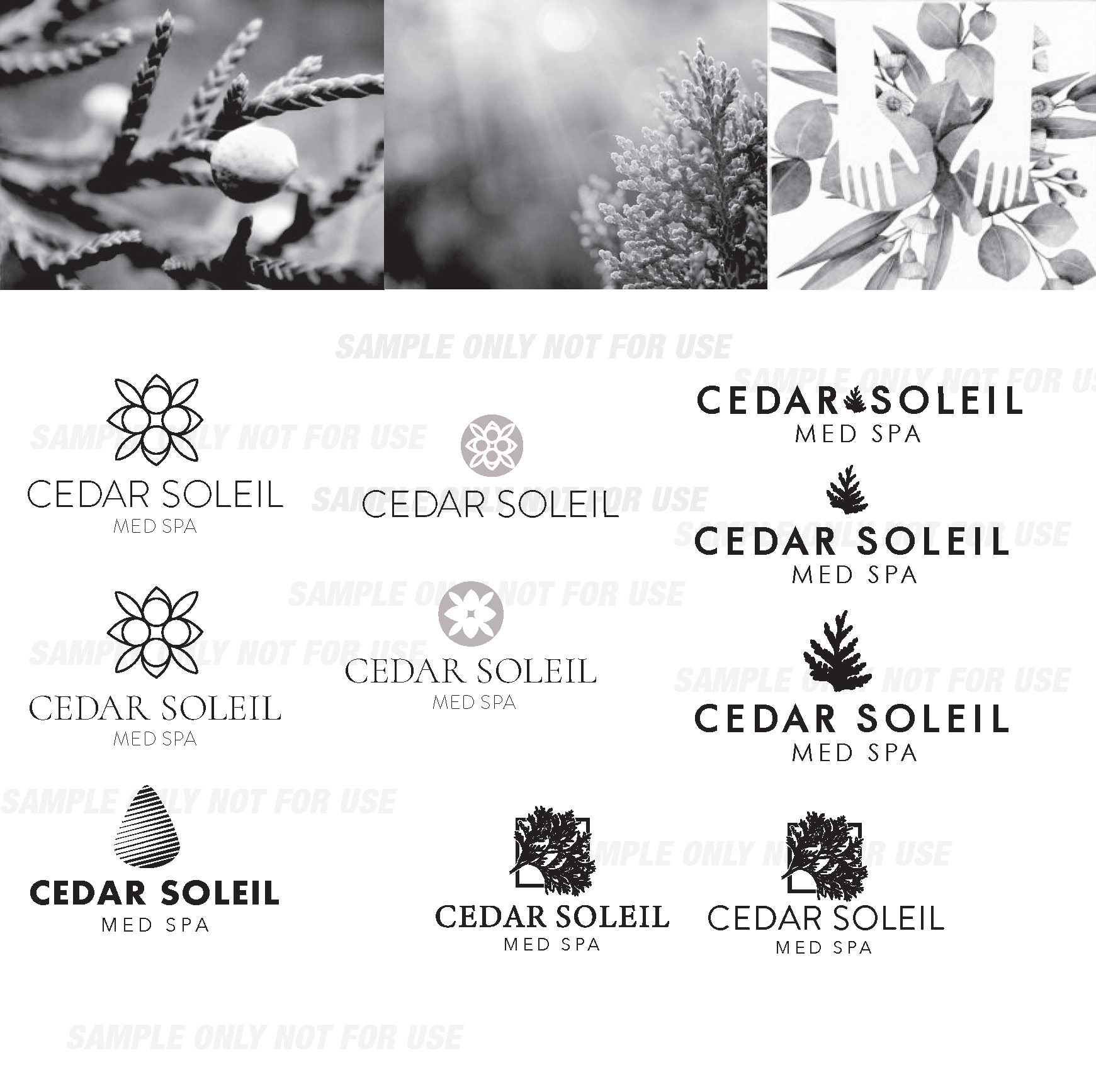
The Cedar Soleil name is inspired by its location on the Cedar River of Iowa. I wanted to create a logo that incorporates Iowa’s Red Cedar trees in a way that was not cliché. I also wanted to avoid typical imagery of trees and landscapes so not to give off landscaper or environmental industry image.
My goal was to create an abstract version of a Red Cedar Tree. The concept of the Cedar Soleil brand mark came from a bud of a Red Cedar tree when looking at it from a top view. Most spas use pink or violet for their brand colors, Cedar Soleil is not a traditional Spa–it is a Med Spa. Focusing on non-invasive cosmetic procedures it was important to differentiate from other spa businesses. The blue is more prominent in the medical profession and I made sure to use a blue variant that was not too masculine.


